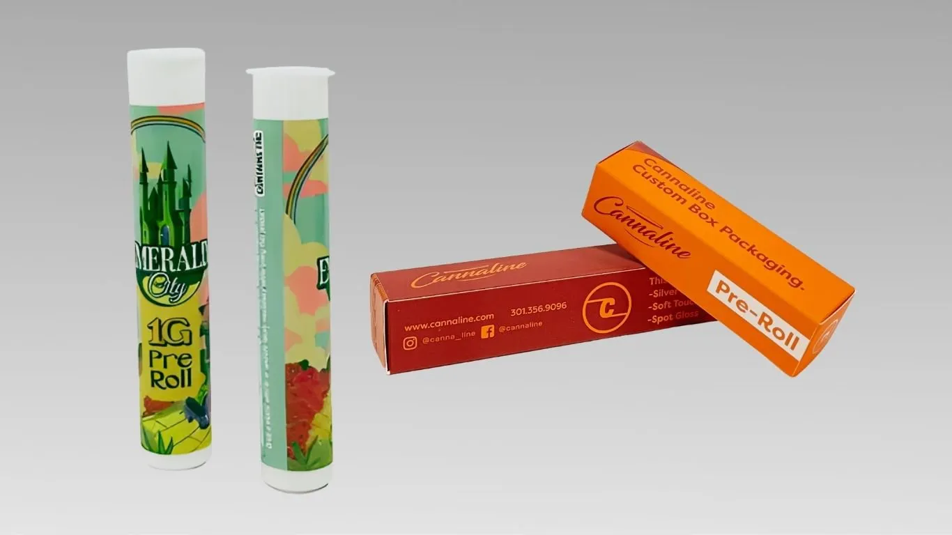
Creative Graphic Design Trends Dominating Today’s Joint Packaging
Joint packaging is moving in a more expressive direction. Across today’s packaging design trends, brands are leaning into bolder typography, stronger color systems, more texture, and visuals that feel less generic. For cannabis products, that matters because packaging has to do more than protect the joint. It also has to create recognition, support compliance, and make the product feel current the moment a customer sees it.
Not every package needs more graphics. In many cases, the strongest joint packaging uses fewer elements with more control. Strong design comes from clear decisions, not crowded panels. Across the category, brands usually get better results by building a visual system instead of relying on one standout detail.
Bold Minimalism Is Giving Joint Packaging More Confidence
One of the clearest shifts in packaging design is bold minimalism. Recent trend roundups point to cleaner layouts, stronger negative space, and bigger, more balanced typography instead of busy compositions. It works especially well in joint packaging because the format is often small and quick to scan. Cleaner layouts also make the product easier to recognize from a distance and easier to understand in the hand.
For cannabis brands, this often means giving the brand name, product type, or strain line one clear place to lead. On pre-roll tubes, that can make the package feel more modern and more deliberate without increasing visual clutter. Cleaner layouts also leave more room for the details that still need to stay readable.
Color Systems Are Turning Joint Packaging Into Faster Shelf Signals
Bold color systems are another dominant trend. Recent packaging reports point to strong color blocking, high-energy palettes, and cleaner visual separation between products. For joint packaging, that matters because color can do brand work quickly. A brand can keep one core look across the line, then use a repeatable color system to separate strains, effects, or formats without redesigning every SKU from scratch.
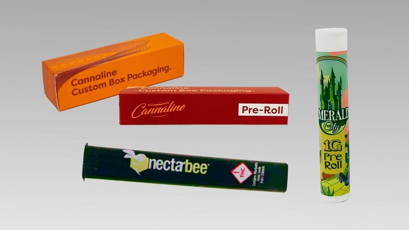
This is one of the easiest ways to make a product line feel more organized. When the same palette logic appears across custom boxes for tubes and other related formats, the lineup starts to look connected instead of pieced together. That kind of consistency makes joint packaging easier to recognize and easier to shop.
Hand-Drawn Marks and Human-Looking Details Are Back
Another strong design shift is the move away from visuals that feel too perfect or too polished. Current design-trend coverage points to sketchy lines, hand-drawn elements, stamped textures, and more visibly human graphic details as a response to generic, over-processed branding. For joint packaging, that can be a useful way to add character without making the design feel chaotic.
These details usually work best as controlled accents rather than dominant graphics. A hand-drawn icon, a rough border, or a small imperfect mark can help the package feel more distinct. Used carefully, those touches add personality while still keeping the line visually consistent.
Texture Is Doing More Visual Work Even Before the Package Is Touched
Texture is also becoming a bigger part of graphic direction. Current design and packaging trend reports describe more visible grains, tactile-looking surfaces, stamped effects, and material-first visuals that make packaging feel warmer and more dimensional. On joint packaging, that can help a simple layout feel more premium without needing extra graphic noise.
This trend works well when the structure of the package already feels clean. A box or tube does not need a complicated composition if the design uses texture, contrast, and spacing well. For brands extending the look across custom printed boxes and smaller formats, tactile-looking design can help the whole product line feel richer without becoming overcrowded.
Retro Cues Are Returning, but in Cleaner Forms
Retro design is still showing up in current packaging trends, but not in the old overloaded way. Recent trend coverage points to heritage references, nostalgic typography, and throwback color combinations used with cleaner layouts and sharper structure. For joint packaging, that can create familiarity and personality while still feeling current.
The most effective version is usually selective. A vintage type style, a nostalgic palette, or a heritage-style badge can be enough. Once too many retro cues stack together, the package can start to feel themed instead of branded. Joint packaging tends to look stronger when older references are paired with cleaner spacing and clearer hierarchy.
The Best Joint Packaging Builds Compliance Into the Graphic System
Even the most creative packaging still has to make room for required information. That is why one of the smartest trends in joint packaging is not purely visual. It is structural. Brands are treating compliance space as part of the graphic system from the start instead of patching it in later. Custom-branded boxes, tubes, and related formats still need to stay fresh, secure, and compliant.
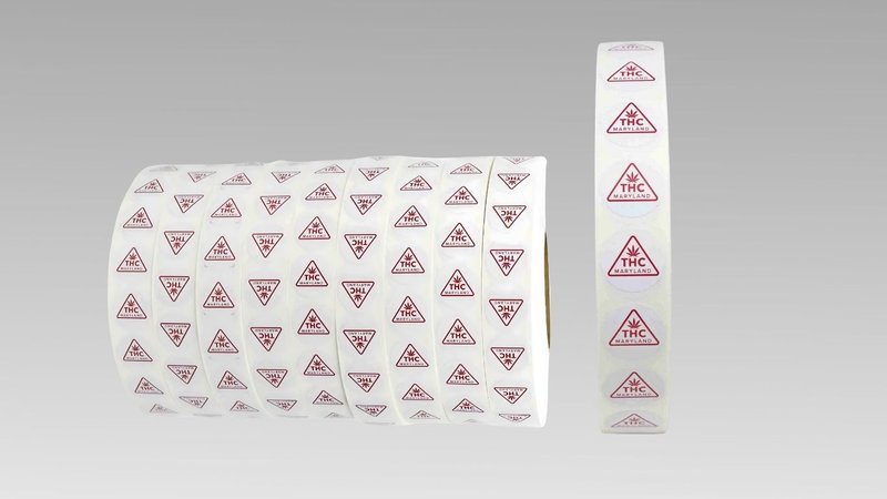
When warnings, product weight, or regulated details are planned into the layout early, the design usually feels stronger. This is especially useful for brands that also rely on compliance stickers or other required label elements. The package looks more intentional when the legal details feel integrated instead of squeezed in at the end.
Today’s Joint Packaging Trends Work Best as a System, Not a One-Off
The strongest trend is not any single visual style. It is the move toward systems. Current packaging design coverage keeps returning to the same idea: clarity, personality, and consistency now matter more than crowded decoration. For cannabis brands, that means the best joint packaging should work across the full line, not just on one standout SKU.
A brand can borrow from bold minimalism, color blocking, hand-drawn accents, texture, or retro cues, but the design still needs to feel connected from one package to the next. That is what turns joint packaging into a more recognizable visual language instead of just another printed box or tube.
For cannabis brands refining how products look on the shelf, joint packaging should be treated as a visual system, not a one-off design exercise. Lock in your free quote for joint packaging options that support a more current, recognizable brand presence.